
Methods
Open science
City regions in Mobiliscope
France
- Albi region
- Alençon St-Lô region
- Amiens region
- Angers region
- Angoulême region
- Annecy region
- Annemasse region
- Bayonne region
- Besançon region
- Béziers region
- Bordeaux region
- Brest region
- Caen region
- Carcassonne region
- Cherbourg region
- Clermont-Ferrand region
- Creil region
- Dijon region
- Douai region
- Dunkerque region
- Grenoble region
- La Réunion
- La Rochelle region
- Le Havre region
- Lille region
- Longwy region
Canada
Latin America
Help to use the Mobiliscope
1) Preliminary notes
Initial data come from Origin-Destination surveys (from 2009 to 2019). Once transformed, these data have been used to estimate the ambient population in every district at exact hours (04.00, 05.00 etc.) during a typical weekday (Monday-Friday).
Number and proportion of ambient population aggregated by district and hour are estimation : they are subject to statistical margins of error.
58 city regions (spread over 5 countries) are included in the actual version of the Mobiliscope (v4.2).
To choose the city region you want to observe, please selection the city region in the drop-down menu ![]() or use the magnify tool
or use the magnify tool  from a search by name.
2) Select a map
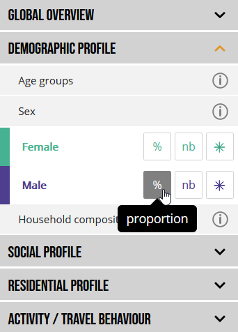
In the left-hand menu, you can choose indicator (classified into broad families such as demographic or social profile) and its map representation - eitheir as aof the total population, or number or flows.
To get informations about indicators, click button on the right side.
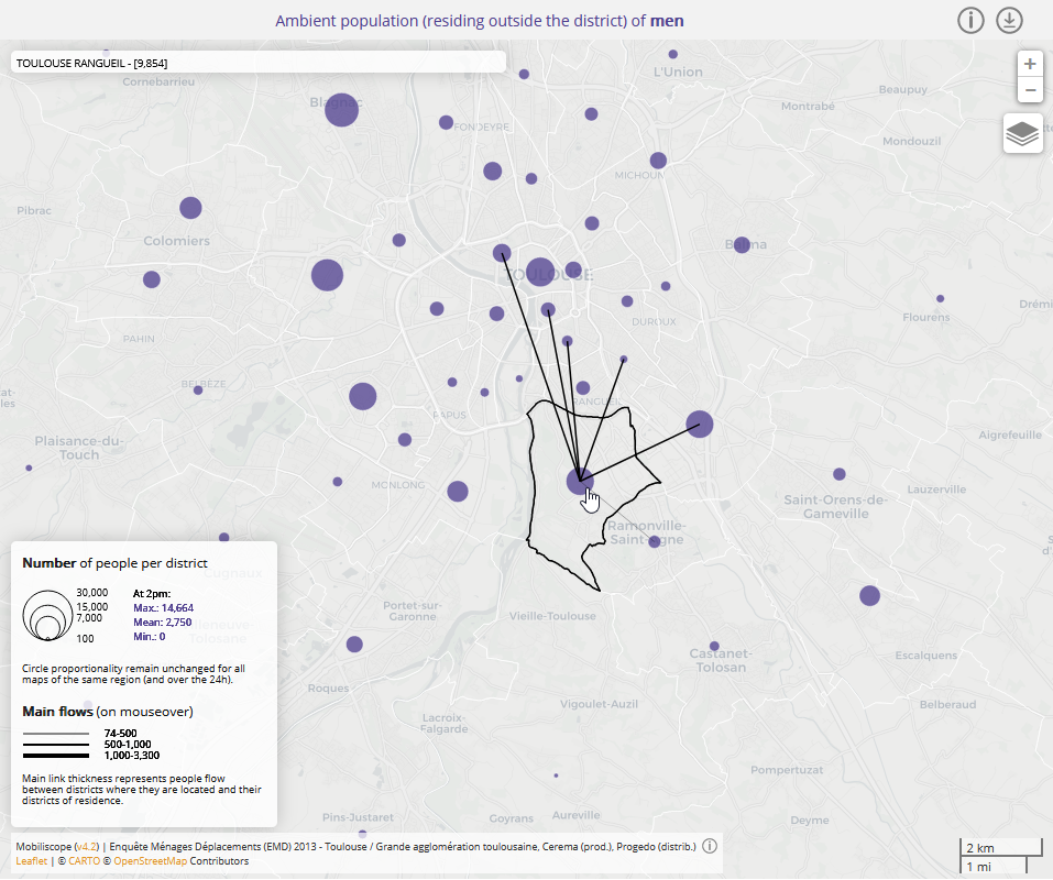
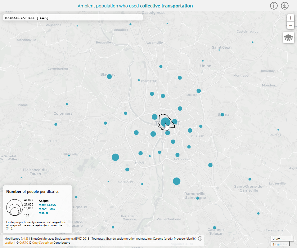
With flows maps you get number of non-resident people at district level. With links (displayed on mouseover), you can see their district of residence (not available on touch screens).
3) Change hours
At the top of the screen, click play button in the timeline to animate map and graphics according to the 24 hours of the day.

4) Explore a specific district
Select one district by clicking on the map.
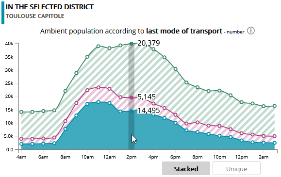
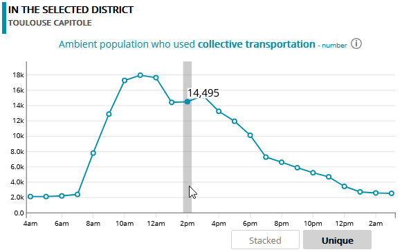
Have a look at the chart entitled "In the selected district" where you can follow hourly variations of ambient population (for each group of the selected indicator) in the district under consideration. Colours have the same colour code than in the indicator menu. Here, last transportation mode used by present population in the selected district was coloured in blue for public transportation, in pink for private motor vehicle and in green for soft mobility.
By clicking on 'Unique' mode, you can limit representation of the hourly variations for only one subgroup :
5) Explore spatial segregation
The block of graphs entitled "In the whole region" displays two segregation indices computed from every district of the region for each hour of the day.
Duncan Index (also called Dissimilarity Index) measures the evenness with which a specific population subgroup is distributed across districts in a whole region. This index score can be interpreted as the percentage of people belonging to the subgroup under consideration that would have to move to achieve an even distribution in the whole region.

The example above displays, hour by hour, the Duncan Index (Paris region - 2010) for to ambient population residing in or outside 'Poverty Areas'. Duncan index range from 0 to 1. A Duncan Segregation Index value of 0 occurs when the share of ambient population residing in 'Poverty Areas' in every district is the same as the share of people residing in 'Poverty Areas' in the whole region. Conversely, a Duncan Segregation Index value of 1 occurs when each district gathers only one of the two population subgroups. In our example, Duncan value is found to be higher between 8pm and 7am, indicating a stronger segregation at night (further away from an even distribution): this corresponds to the hours when most of the individuals are at home or in their district of residence. The value of the index decreases during the day: because of their mobility, people residing in and outside of 'Poverty Areas' are more mixed (situation closer to even distribution).
By clicking on the "Moran" button, a second graph is displayed with the Moran index which measures the similarity in the profiles of the ambient population for neighbouring districts.

The Moran index values vary from -1 to +1: the closer its value is to 1, the more similar the spatially close districts are (with same distribution of the subgroup under consideration); the closer its value is to -1, the more dissimilar the spatially close districts are (with different distribution of the subgroup under consideration). When the Moran index value is 0, no similarity/dissimilarity pattern between neighbouring districts appears in the whole region. In our example, the Moran index values are positive and increase during the day: it means that spatial blocks of similar districts (according to the proportion of inhabitants of 'Poverty Areas') are formed during the day. This result does not contradict Duncan's index but complements it: people residing in 'Poverty Areas' visit during the day other districts than their residential district but tend to visit districts close to each other. And the same is true for people residing outside 'Poverty Areas'
It should be noted that in the case of an indicator subdivided into two groups (eg. male/female or people residing in/outside 'Poverty Areas'), Duncan and Moran values are the same for the two groups and therefore the curves are overlapping.
For more information on the two indices used (Duncan et Moran), click help button next to the index name.
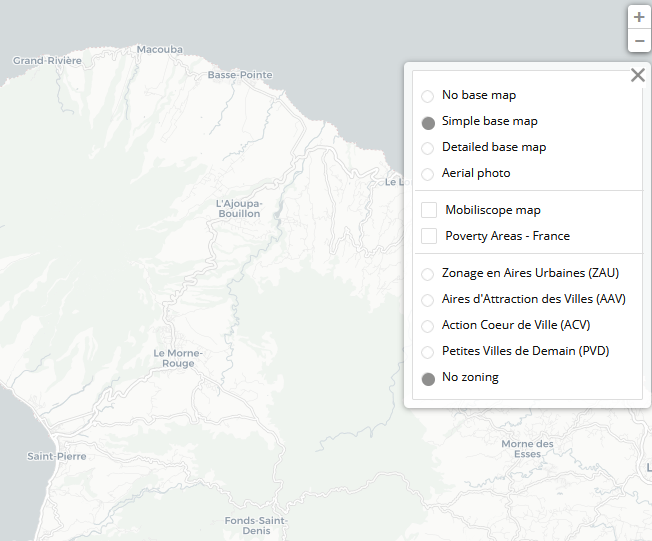
6) Change map backgrounds
By clicking on the  button in the central map, several layers can be displayed to make it easier to find your way around the interactive map: a simple base map (default layer), a more detailed one and aerial photos.
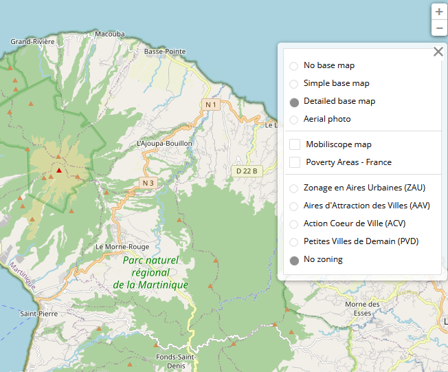

In French cities, you can display official statistics zonings (Zonage en Aires Urbaines - ZAU de 2010 ; zonage en Aires d'Attraction des Villes AAV de 2020)
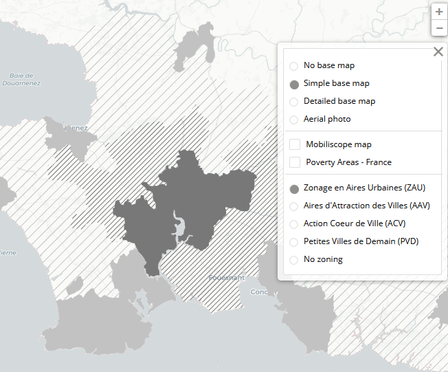

or some institutional zonings such as 'Poverty Areas' (QPV) or those related to 'Action Coeur de Ville' (ACV) or 'Petites Villes de Demain' (PVD) programs.
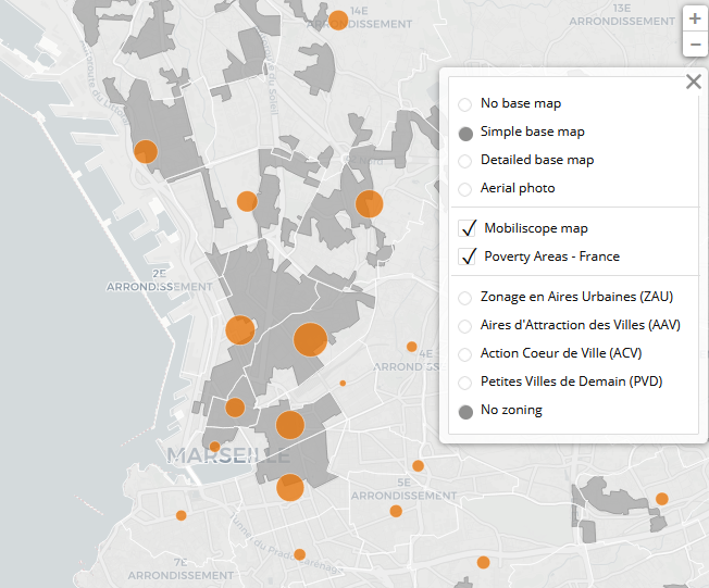
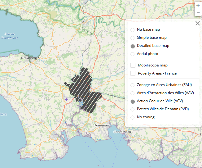
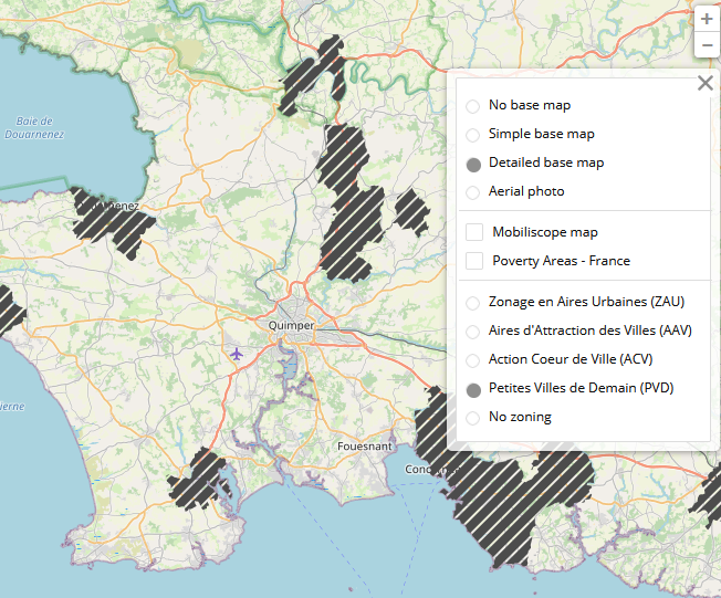
A tool can be used to list the French Mobiliscope areas according to their location in these three institutional zonings (ACV, PVD, QPV).
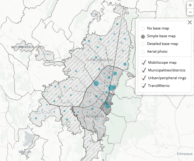
In Latin American cities, map backgrounds about municipalities and centre/periphery rings are available, as well as TransMilenio in Bogotá.
7) Download data
Data displayed in the Mobiliscope are under open license (ODbL). Mobiliscope data are reusable as they remain under open license and that the sources are mentioned.
By clicking on the  button above the central map, you can download data aggregated data by district and by hour. By clicking on the button in the bottom graph, you can also download data about hourly segregation values (Duncan's or Moran's index) computed for the whole region over the 24 hours period.
8) Partager une vue particulière
By clicking on the button  , you can copy the URL of your map or share it directly by email or on social networks. The URL records your choice of indicator as well as the district and hour selected.
To go further
You can also visit the information pages of the website to learn more about our methodology and Geoviz process, as well as the codes and data available in open access.
Enjoy!
Geovizualisation
To explore city around the clock
Every 'geoviz' page display a city region whose the geographical perimeter corresponds to the origin-destination survey under consideration. The city region is named according to name of the central city. Its geographical perimeter, which varies in size from one survey to another - they may be urban agglomerations, departments or regions - is divided into districts corresponding to neighbourhoods, municipalities or groups of municipalities.
For each city region, the interface is composed in the same way:

1) In the indicator block (on the left-side), users can choose to display the whole ambient population ('Global overview') or to look at the ambient population according to demographic profile (sex and age), social profile (socioprofessional status, educational level and occupational status), or residential areas. It is also possible to explore the types of activities carried out by the ambient population in each district in a given hour, as well as the last mode of transport used to get to destination.
2) In the center of the screen, maps are displayed according to the indicator chosen in the indicator block. Maps are dynamics: users can zoom, move around it, display the names of the sectors on mouseover. To make it easier to find your way around, Open Street Map layers or aerial photographs can be displayed.
3) In the right side of the screen, a first chart (top) shows hourly information for a specific district (selected on the map). A second chart (bottom) provides segregation values in the whole city region around the clock.
4) With timeline (on the top), users can animate maps hour by hour.
For every indicator, one specific colour code has been applied in the maps and charts. The colour charts were constructed using the color gradients explorer.
Central map
Three map representations can be displayed: choropleth maps, maps in proportional symbols and 'flow' maps.
Data used in the maps are under ODbL license and can be downloaded by clicking the button above the title of the central map. More informations here.
Choropleth maps

Choropleth maps display estimated proportions of people in a specified group at district level. In the case of the 'Whole Population' indicator, population densities (people per km²) can also be displayed. Five classes have constantly been defined (8 classes for population densities). Same class boundaries apply over the 24h period for all maps of the same city region. Different discretisation methods are used to delineate the thresholds of these classes.
- For the majority of the avalaible indicators (Age groups, Household compoistion, Education level, Socioprofessional status, Occupational status, Professional informality, Socio-economic stratum, Housing tenure and Mode of transport), we used a quintile method based on the values distribution over the 24h period in every city. Class intervals can then diverge according to the city region.
- The equal amplitude method has been used for four indicators: Residing in/out the district; SexFrench 'Poverty Areas'; and Household income. For indicator 'Residing in/out the district', the legend is identical for all city regions and for both modalities since the distributions always range between 0% and 100% (of residents or non-residents per district). For the three others indicators, class boundaries differ from city to city due to highly variable statistical distributions.
- Discretization in natural thresholds (Jenks) is used for the indicators Residential location in urban/peripheral rings, Department of residence (Paris region) and Activity from the distribution of the data in every city region. Class boundaries therefore vary according to the city region under consideration.
- For the Whole Population indicator, population densities are discretised into 8 classes according to the nested mean method. The resulting classes are therefore region-specific, but remain the same throughout the day in a given city region.
Proportional symbol maps

Proportional symbol maps display estimated number of people at district level. Circles are proportionally sized according to the number of people and are rigorously similar over the 24h period for all maps of the same city region (but can diverge according to city regions).
Proportional symbol and flow maps

Flow maps display the number of "non-resident" population located in the district. Circles are proportionally sized according to the number of people and are rigorously similar over the 24h period for all maps of the same city region (but can diverge according to city regions).To prevent unnecessary duplications, flow maps cannot be displayed for indicator Residing in/out the district and for the group 'at home' from Activity indicator.
Link thickness (displayed on mouseover) represents estimated flow of "non-resident" people according to their districts of residence. For confidentiality and statistical power reasons, we have introduced a filter for not displaying the estimated flow of people from their original districts of residence when the crude number of concerned respondents is below 6. Link thickness are similar over the 24h period for all maps of the same city region (but can diverge according to city regions).
Map backgrounds
For every city region, the user can choose to display:
- a simple base map - OpenStreetMap (default choice)
- a detailed base map - OpenStreetMap
- an aerial photo
In France, it is also possible to display official statistics zonings or institutional zonings.
- Zonage en Aires Urbaines (ZAU) 2010 simplified into 5 categories: Major centre (10,000 jobs or more); Small (1,500 to less than 5,000 jobs) and Medium centre (5,000 to less than 10,000 jobs); Peripheral area (of a large, medium or small centre); Multi-polarized; Isolated.
- Aires d'Attraction des Villes (AAV) 2020 in 5 categories : Main center ; Main center: other ; Secondary center ; Peripheral areas ; Outside the attraction of centers.
- 'Poverty Areas' (Quartiers Prioritaires en Politique de la Ville - QPV)
- Municipalities ('communes') included in Action Coeur de Ville (ACV) programm
- Municipalities ('communes') included in Petites Villes de Demain (PVD) programm
Zoning labels and outlines are displayed on the map when the mouse is hovered over them.
A tool can be used to list the French Mobiliscope areas according to their location in these three institutional zonings (ACV, PVD, QPV).
In Latin America, users can also display on the map:
- the limits of the municipalities/districts
- the centre/periphery rings
- the layout of the TransMilenio (Bogotá).
Chart

The top chart displays the estimated number/proportion of people in the district selected in the central map over the 24h period. Two modes are available: unique or stacked.

In the buttom chart, two segregation indices measure spatial distribution over the 24h period in the whole city region
- Duncan dissimilarity index measures the extent of segregation of a group of individuals across spatial units. Values range from 0 (minimum segregation) to 1 (maximum segregation). Values express the proportion of individuals of a given group who would have to move to another district (without being replaced) to get similar proportion of people from this group in every district. When this index is used to measure the segregation of a population divided into two groups only (e.g. men and women), the values of this index are the same for both groups.
- Moran index is based on both feature locations and feature values simultaneously. It may be used to express correlation in social composition among nearby districts. Values ranges from -1 (when districts that are spatially close to each other tend to have dissimilar social composition - negative autocorrelation) to 1 (when districts that are spatially close to each other tend to have similar social composition - positive autocorrelation. A value close to zero expresses no spatial structure.
In charts representing Duncan or Moran indices, minimum and maximum values are similar for all groups of a same indicator which makes them comparable. Moreover, intervals between minimum and maximum values cannot be less than 0.4 not to give too much importance to minor variations in spatial structure.
Duncan and Moran indices are respectively computed from OasisR and spdep R packages.
Hourly Duncan and Moran values displayed in the Mobiliscope are available in open-data.
